 Web
Web
New versions of pasteur.fr and research.pasteur.fr online
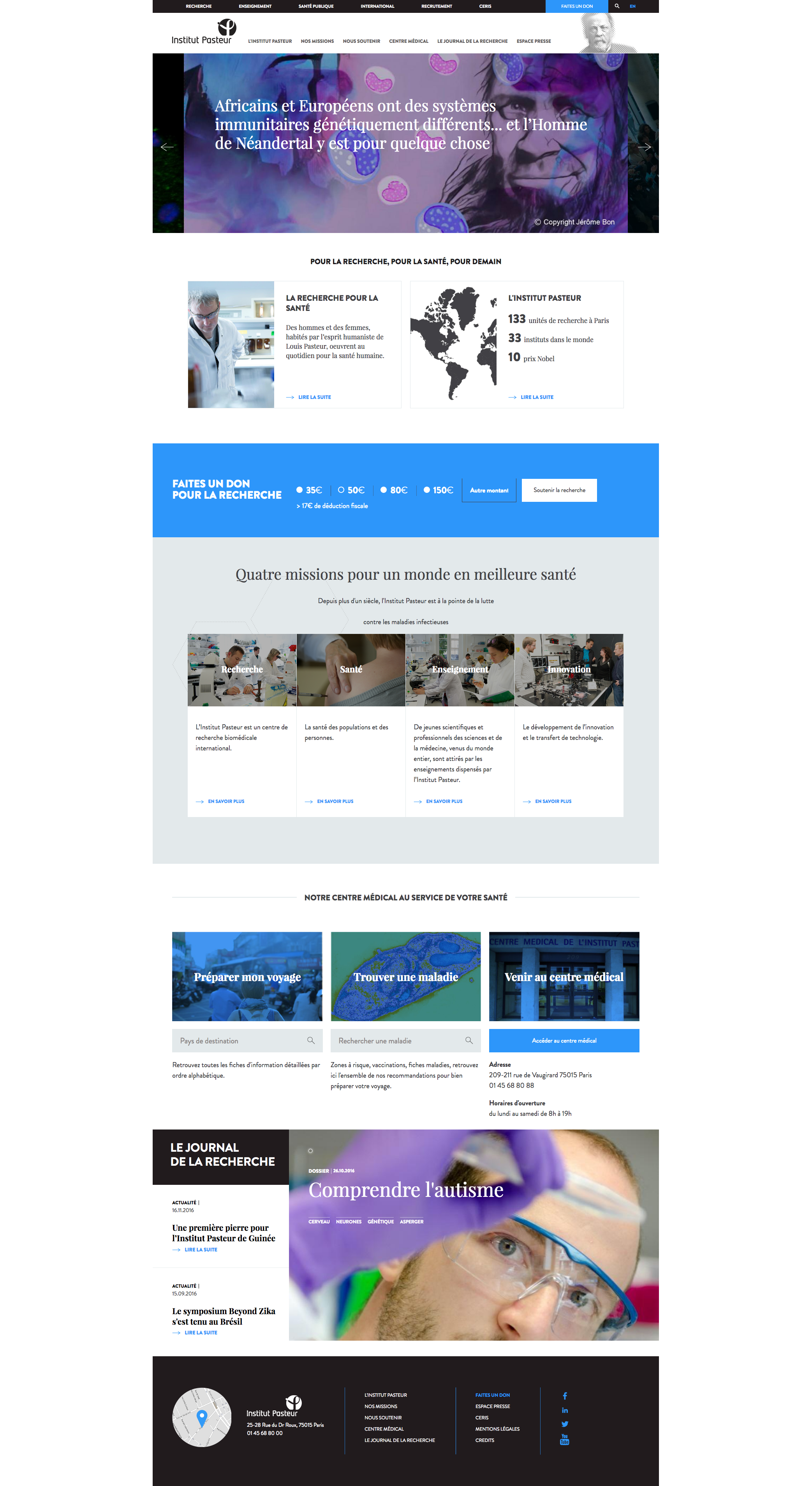
New version of pasteur.fr online
On January 6, the new pasteur.fr website was officially launched. If you haven't already checked it out you can do so here: https://www.pasteur.fr/fr
 The complete overhaul of the website was carried out with two main aims in mind:
► To target two separate communities within a single website:
- the general public, with the addition of new sections to help them get to know the Institut Pasteur better: "Our missions", "The Research Journal", "Medical Center"
- a specialist audience – mainly scientists, by providing several ways of accessing the "RESEARCH" space created just over a year ago (a new version of which has also just been launched to coincide with the new website – see below), but also students, job seekers, the International Network, etc.
► To bring the website into line with new trends in Internet usage, especially the huge number of visitors who consult the Institut Pasteur site from mobile devices.
Achieving these two aims involved implementing several changes, which you can discover for yourself online:
- A totally new graphic standard to enhance and modernize the Institut Pasteur's image,
- A "responsive" design for all pages,
- New versions of all the texts presenting the Institut Pasteur and its component parts as well as all the fact sheets on specific diseases, which are among the most popular pages on the website,
- An entirely new editorial policy, moving from static content to a more dynamic approach, which will also feed into the Institut Pasteur's social media pages.
Many people have been working on this major project for several months now, including the communications team in the Department of Communications and Fundraising, the Information Systems Department, and representatives of all the different administrative and research departments who have provided texts and helped update all the sections. A big thank you to all those involved!
Launch of the second version of research.pasteur.fr
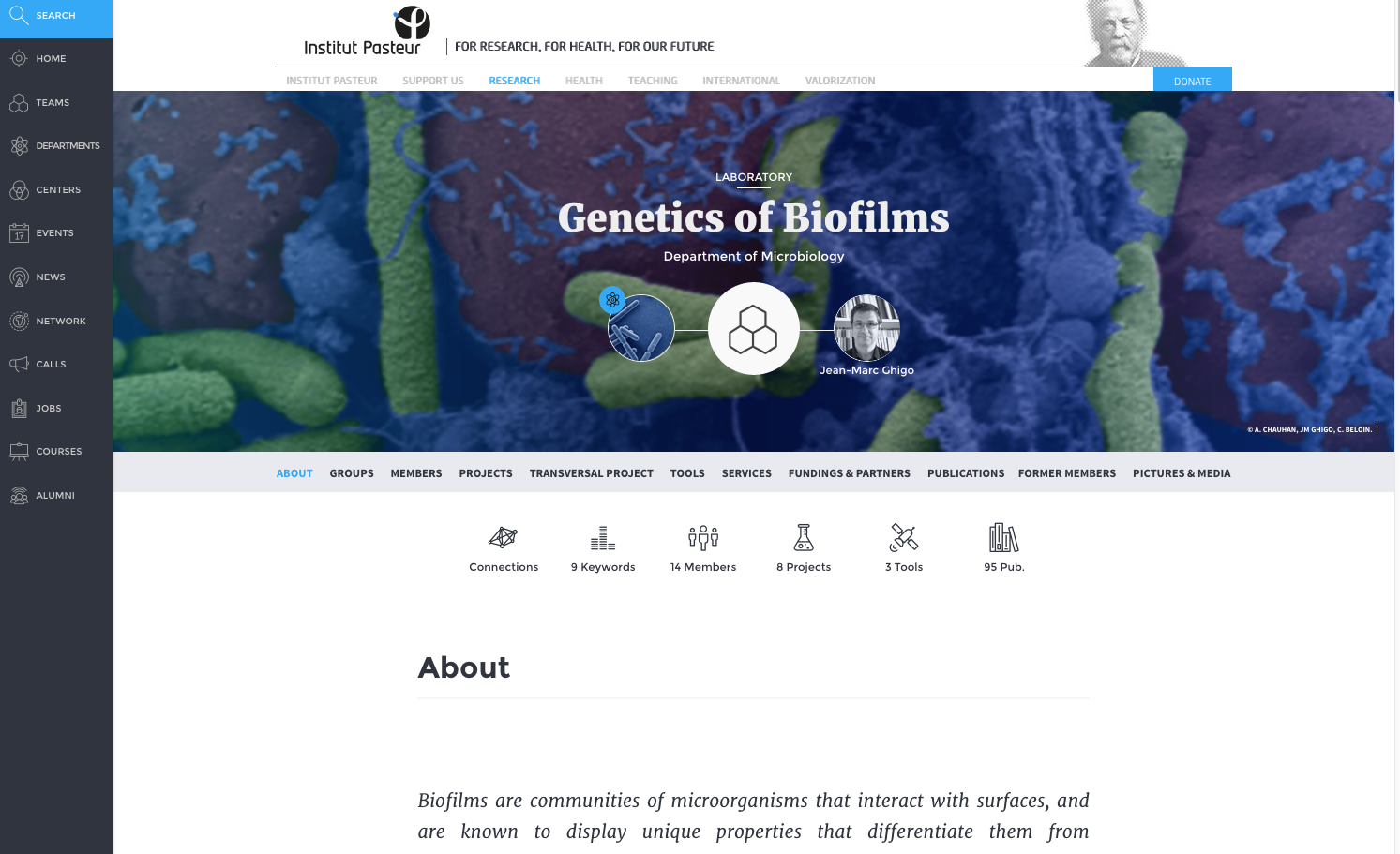
Since it was launched back in October 2015, the research.pasteur.fr website has continued to be developed to take account of user feedback. Navigation around the site was changed to make it easier for users to find the content they were looking for. Version 2 of the website is now online and has a range of great new features, including the following:
 - The left-hand menu on a black background is displayed on all pages, so users are just a click away from the main website categories at all times. They can choose to leave the menu completely open or just display the icons.
- The home page has been enhanced: a new banner and user-friendly menu make it easier to access the different content, the events on the home page can be displayed in calendar form, and only calls, events, news and jobs are now displayed on the home page (the display is automatically adapted if there are fewer than four items in any of these categories).
- Entities are displayed by alphabetical order of their director, making them easier to find. Filters can be used to select the different entity types.
- The departments page displays all 11 departments at once, providing easy access to the main page for each department. - The pages have been redesigned: the banners have been adjusted and now feature informative labels for easier browsing; icons give access to different types of information (projects, members, keywords, connections, publications, etc.); "related content" is less visible (at the bottom of each page) and can be selected; keywords appear in a pop-up and are sorted by category.
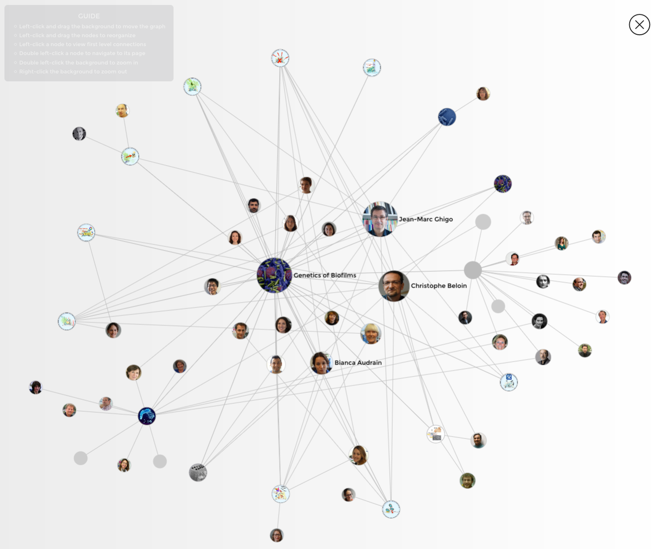
- A tool enables users to incorporate any events, calls or jobs they are interested in into a personal calendar (Outlook, Yahoo Calendar, Google Calendar, etc.). - Interactions between members, entities and other structures can be displayed as a graph of connections (the "Connections" button on member and entity pages).
- A "Timeline" button displays content about a given member (publications, projects, courses and news) on a timeline.
This is just a taster of all the new features in version 2. Check it out for yourself by heading to research.pasteur.fr.
Contact: Marie-Laure Rosso (marie-laure.rosso@pasteur.fr)