October 13, 2023
Bulletin interne de l'Institut Pasteur


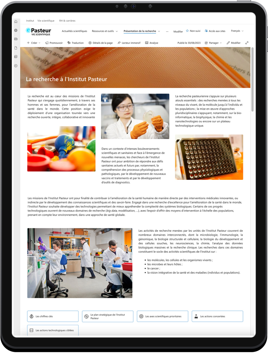
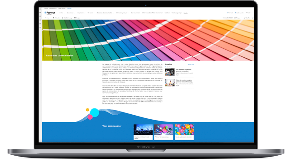
A first glimpse of ePasteur – the new-look intranet with a user-friendly interface and stylish design!
As presented in the newsletter on January 13, a project to modernize and revamp the Institut Pasteur intranet was launched a year ago.

Supported by the Institut Pasteur senior management team and led jointly by the Department of Communications and the Information Systems Department, the project is also being carried out in collaboration with several other departments and with the input of multiple intranet contributors and users to ensure that all needs and use cases for different professions are represented.
The large-scale project involves several phases to meet all the objectives of such a crucial internal communication tool:
 organizing content to provide structured, clear, up-to-date information,
 improving ease of browsing for simple, intuitive access to articles, documents, news and different working tools,
 offering access to spaces designed to facilitate collaboration,
 incorporating aspects from the graphic standard for a new visual identity.
Realizing these key objectives has been a challenging task. The aim is to make the future intranet an effective ally that facilitates day-to-day work for staff, offers a platform for performing recurrent and one-off tasks, allows us to share information effectively and affirms our shared identity, bringing the entire Institut Pasteur community together as we work towards our shared ambitions.
 One of the main phases of the intranet project was to establish a visual identity that can serve as a basis for a unique, easily recognizable graphic environment so that users can quickly find their way around the Institut Pasteur ecosystem. This visual environment reflects the name ePasteur, which you voted for back in January.


For its October 13 issue, as we look ahead to the upcoming launch of ePasteur (more information coming soon!), the newsletter team is offering you a sneak preview of the new intranet.
Designed around the Institut Pasteur blue, the site also features a gradient in these same tones, punctuated by a few touches of brighter, more vibrant colors to add movement and depth.
Distinct solid blue zones, some featuring curved lines and background ripple effects to create a subtle graphic flow, will be used to insert clearly visible sections for users.
ePasteur has an unmistakable dynamic graphic identity and a unique character – one that inspired us for this week's newsletter when we decided to base the entire issue on the ePasteur colors!
 The aims of the graphic choices were:
 to be in line with the Institut Pasteur's graphic standard (images and colors)
 to create a clear link with the Institut Pasteur's other digital spaces (pasteur.fr for the general public, research.pasteur.fr for the scientific community)
 to establish a recognizable identity that makes this working tool stand out, encouraging staff to make use of it and incorporate it into their working day while allowing a degree of flexibility
 to develop a design that highlights the organization of information into different spaces (institutional, scientific events, careers and HR)

These choices will apply to the three spaces that make up the future intranet: the institutional space, the space for scientific events and activities, and the HR and careers space, each of which will have its own logo.
Make sure you don't miss next week's newsletter to find out more about the final stages in this major project led by and for Institut Pasteur staff!
